Monday, 2 December 2013

1970's compared to 00's


Year: 1979
Brand: Chanel No.19
Model: Christie Brinkley

Christie Brinkley is a well known model from the United States. She is also a writer, photographer, designer and actress amongst other things.
She was 25 years of age when this photograph for Chanel No.19 was taken.
Using a women with such a diverse range in careers must have been incredibly influential in the campaign due to the context of the 70's.
At a time when the Women's Liberation Movement was in full swing, this particular advertisement coincides with the 'strong, independent' women attitude that this particular movement was trying to enforce.
Evidence for this is provided within the tag line: "Witty. Confident. Devastatingly feminine" and even "The Outspoken Chanel", implying that women are all of these things and therefor, so is the perfume.
Her pose and the way she is 'grabbing' the male model also suggests that she is a female who takes what she wants when she wants it. Reflecting the views of the society at the time.


Year: 2012
Brand: Chanel No.5
Model: Brad Pitt
Ad Director: Joe Wright

In complete contrast to the advertisement of the 1970's, Chanel released this ad in 2012 starring the well known and recognised actor, Brad Pitt. One of the first male models to promote the brand, ever.
Although this immediately seems to be different from the Chanel No.19 advert in the use of a male model rather than a female model, the black-and-white image, and the brand number itself, there are actually many similarities between the two campaigns.
According to Vanity Fair writer Amy Fine Collins, she claims that "in anointing Pitt the new face of its signature fragrance, the House of Chanel is subtly circling back to its gender-twisting origins". Which relates heavily to the previous advert of the 70's in its role of gender empowerment (although they may have been more likely to have chosen Brad Pitt as a new and refreshing way of advertising the product, or simply to make more men buy the product).

References:

Anon (2013) Christie Brinkley Biography [Online] http://christiebrinkley.com/bio.html

Sowray, B. (2012) Chanel No.5 director [Online] http://fashion.telegraph.co.uk/news-features/TMG9742060/Chanel-No.5-ad-director-I-dont-know-what-the-dialogue-means-either.html

Collins, A.F. (2012) Smelling Them Softly [Online] http://www.vanityfair.com/hollywood/2012/11/brad-pitt-chanel-no-5-perfume

Image links:

http://forums.thefashionspot.com/f135/vintage-ads-1970s-fragrance-beauty-misc-68886-2.html

http://www.selectism.com/files/2012/10/chanel-no5-brad-pitt-11.jpg

Thursday, 28 November 2013

The Real Mad Men

1. Summary of the aesthetic & social context surrounding DDB ads in the 1950's & 1960's.

Up until the late 1950's, accountants were the main face of advertising. Well paid and from good educated backgrounds, it meant that the customer never met the creative minds behind their adverts, such as the copywriters. But underneath this exterior, a 'Creative Revolution' was beginning to form.
New, young, fresh and exciting minds were appearing all over the USA, developing and changing the arts from music to literature to revolutionary techniques within painting (such as Jackson Pollocks 'action painting' which had never been seen before) and especially advertising.
Andrew Cracknell, the writer of the book The Real Mad Men, highlights one of the remarks of DDB's most influential founder, Bill Bernbach. Speaking of events within the 1950's and 60's, Bernbach talks of these new creative minds, claiming that many before them had been "phony" and "it was the one thing they did not want to be, and the one thing they resented above all others about the current advertising".
This is supported by art director, George Lois, who worked for DDB in the 1960's: "It was an inspiring time to be an art director like me with a rage to communicate, to blaze trails, to create icon rather than con."
JWT (previously known as J.Walter Thompson) was DDB's rival advertising company during this era and had managed to maintain the number one spot for most of this time.
However, due to DDB's new way of working to create successful advertisements (compared to the usual bombardment and repetition used by JWT advertising and the neglect to communicate on a personal level with the customer) according to Cracknell "...a succession of campaigns began to demand that their competitors take them seriously".
Bill Bernbach was also the first to combine the creative skills of both the copywriters and the art directors by allowing them to work together. A move that clearly worked in the favor of DDB.
No longer afraid of the strict rules applied to advertising in the time before them, DDB's art directors and copy writers began working with force. Playing around with imagery of the campaign on the page itself, the aim was to create the message and the point of the product "visually".
Advertisements no longer had to be complicated and over packed with information, they just had to reflect the message provided by the product itself. An ad showed the product for what it was and the way it was. Promoting truth with a hint of creativity, aesthetically pleasing the consumers eyes.


2. Summary explaining why the 'Think Small' campaign 'epitomises the Creative Revolution'.

One of the DDB's Volkswagen 'Think Small' adverts of the 1960's.

Volkswagen cars were originally made by German manufacturers for Hitler himself. In the 1960's, DDB were faced with the challenge to make the society of the USA, who had only a few years before suffered the loss of loved ones, were stuck in a struggling economic situation due to WWII and only 10 years before found out information of  the tragic events of the holocaust, to love this unloved car. (Another challenge in itself due to a society use to luxurious and powerful cars, much unlike the VW.)
With the budget of $800,000, DDB created one of the most well known, and most effective campaigns of the era, changing advertising to what we know today.
Advertising before was consistently the same, bombarded by information and repetition, it had began to become boring and dull. Along with this, a bad name was being placed on advertising campaigns, mainly due to false claims with products. It was not a business many were proud to be in.
Carl Hahn, who was in charge of the VW in the United States, was beginning to become desperate with worry with the thought of an a agency unable to create a campaign to fit the product. Every other agency had consistently come up with the same proposal - a beautiful house, with happy people, well dressed with a glamorous looking car. These apparently "...didn't have any life".
DDB broke these rules. Pushing boundaries of both creativity and how advertising was used. Instead of viewing the customer as just that, those employed under the company were encouraged to empathise and understand more about the product and those who created it. Customers were allies, not simply ways of making money.
Helmut Krone, a German American, was the chosen art director for the campaign. He showed his dedication to the company by visiting Germany several times, applying his view that "the attitude and body language of the artwork should reflect the attitude and body language of the product". VW adverts didn't need to be cluttered and filled with information, it should be just like the car, simple and effective.
According to Andrew Cracknell, the VW 'Think Small' advertisements of the 60's was such a revolutionary campaign, that the minds who created it left a legacy so large, individuals working within DDB today "...feel obliged to try to live up to their standard".
With the simple black and white image and memorable tag line, DDB's Volkswagen 'Think Small' campaign highlighted the changing world of advertising and, therefore, epitomises everything the 'Creative Revolution' stood for.

Bibliography:

Cracknell, A. (2011) The Real Mad Men [Book]

Wikipedia (2013) JWT [Online] http://en.wikipedia.org/wiki/JWT

Belleras, C. (2011) Think Small [Online] http://www.clemengertas.com.au/2011/10/what-is-creativity/think-small-february-22-1960-vw-beetle-ad/


Saturday, 23 November 2013

New York World's Fair (1939)

Located in America's Flushing Meadows-Corona Park from 1939 - 1940, the idea of the fair was to show the world of the "future". Not necessarily what it may be like or trying to predict what may happen but more of a way of "presenting a new and clearer view of today in preparation for tomorrow" This was reassuring to society at the time, as it appeared during the after years of the first world war which created a huge economic decline and unknowingly before the events of WWII occurred.
According to many critics, the fair "provided the one saving grace which all of America needed - it provided hope".
Over the two seasons the exhibition was open, it is estimated that nearly 44 million people attended and visited the fair, where they were seen "enjoying entertainments from marionette shows and thrill rides to 'girlie' shows and choreographed aquatic extravaganzas."
The theme of the 1939 New York World's Fair was one of refreshment of new and exciting ideas, forms, views and mostly consumer products. It was trying to change culturally, politically, globally and commercially, the society of post war. Some believe it shaped and defined these things so much that it still effects us, the modern consumer, today.
On display at the time were exhibitions, restaurants, theatres, artwork, and plays. There was even a national cash register, "The Road of Tomorrow" an elevated highway made from cork and rubber, futuristic models of New York city, auditoriums, modern machines and techniques to package products, 'Fun Zones' which included games and rides for entertainment and buildings that represented various world destinations (such as Russia and Poland).

Arial view of a small section of the New York World's Fair 1939. The Trylon and Perisphere structures later became the symbols for the fair.
It was also during this time, that William (Bill) Bernbach (soon to be one of the founders of DDB Doyle Dane Bernbach) was working for the Schenley Distillers Company, Pennsylvania. This would change, however, when the fair closed in 1940, where he began his career as copywriter for William Weintraub ad agency.
Bernbach may have been influenced by what he saw at the New York World's Fair and how the viewers reacted towards it. Much of what happened at the fair can be compared to Bernbach's advertising style - which included inventing new and exciting ways, one step ahead of everyone else, in promoting or selling products.

Bibliography:


Wikipedia (2013) 1939 New York World's Fair (Unknown Author) [Online] http://en.wikipedia.org/wiki/1939_New_York_World's_Fair

America Studies (2009) Welcome To Tomorrow (Unknown Author) [Online] http://xroads.virginia.edu/~1930s/display/39wf/frame.htm

Taylor. A (Author) The Atlantic (2013) The 1939 New York World's Fair [Online] http://www.theatlantic.com/infocus/2013/11/the-1939-new-york-worlds-fair/100620/

Transatlantic Perspectives (2013) William Bernbach (Unknown Author) [Online] http://www.transatlanticperspectives.org/entry.php?rec=29

Thursday, 21 November 2013

LMS: Modernism

When comparing the advertisements of London Midland & Scottish Railway Company (LMS) of the 1920's to the associated aspects of the Modernism art movement in the late 19th and 20th centuries, it is clear how much this particular campaign reflected the social and economic context of this particular period.

Modernism appeared just after World War 1, and according to Victoria and Albert Museum London, was "...a period when the artistic avant-garde dreamed of a new world free of conflict, greed and social inequality."*

It was also at a time where industries and the growth of cities were developing on a large and rapid scale, therefore, also developing the views of those "...who felt the "traditional" forms of art, architecture, literature, religious faith, social organization and daily life were becoming outdated in the new economic, social, and political conditions of an emerging fully industrialized world."**

Artists of this movement included Pablo Picasso, Marc Chagall, Hans Hofman, Henri Matisse and many more. It is when comparing the advertisements of LMS and the artwork of these artists that we, the viewer, can begin to see how this campaign was typically modernist.

Looking at Henri Matisse and his work entitled 'Greek Torso and Flowers' Produced in 1919, the technique used is similar to the technique used in the ads of LMS (as shown in the images below).

The use of bold, block colours and quick broad outlines are shown in both the advertisement and the artwork. Breaking the conventions of the stereotypical photo-realistic art work of the previous era. The idea is to draw what you see with more passion and spontaneity, rather than with perfect accuracy.
The composition is also meant to work together, pleasing the eye of the viewer. The items withing the image or painting don't necessarily have to be in correct proportion or positioning. It attracts and hold the attention of those who see it. Once again, perfection doesn't have to be realistic but more a colourful and bold representation of what the artist sees. A new and refreshing perspective. 

*http://www.vam.ac.uk/page/m/modernism/
**http://en.wikipedia.org/wiki/Modernism

Henri Matisse - 'Greek Torso and Flowers' (1919)
LMS Ad of the 1920's.

Monday, 18 November 2013

Mythology and Ideology within an ad

Givenchy: Ange ou demon 


- female/Caucasian/blonde hair/20-25 years of age.
- slight purple on bottle.
- black ribbon mask.
- white dress.
- hand is on wall.
- stairs in background.
- shadow on the bottom of image.
- lighter at the top.
- two tag lines:
"Ange ou demon"
"The new feminine fragrance"

Mythology/Ideology: The use of the colours, shadows and lighting in this image reflect the name of the perfume - "ange ou demon" (angel or demon).
The white of the dress and the spotlight on the model represent the 'angel' side. With the dark mask and the dark shadows portraying the 'demon' side. (This is also reflected within the perfume bottle itself, but with the dark and light the opposite way in comparison to the photograph).

Intertextuality: Masquerade balls of the 15th century. Religious connotations. Femme fatale. Also, when I first saw this image I thought of the child story 'Cinderella'. This was mainly due to the stairs in the background and the mask. It reminds me of the ball she attends before the clock strikes 12. Leaving her golden slipper behind on the stairs as she runs away.

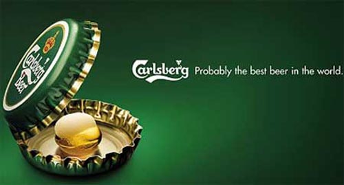
Carlsberg Beer:

- green/white/yellow/red on crown
- bottle caps/yellow pearl
- the 'oyster' has a light glow around it.
- tag line: "Carlsberg, probably the best beer in the world"

Mythology/Ideology: A very simplistic advert that clearly implies that Carlsberg beer is like the oyster that contains the pearl. Or simply, implying the sentence "the world is your oyster" to those that drink their beer - giving the consumer the feeling of empowerment and freedom to do as they choose.

Intertextuality: The saying was originally first seen in Shakespeare's play 'The Merry Wives of Windsor'. One of the most well known sayings.

Thursday, 14 November 2013

Deconstructing an ad


SAMU Social:

"...is a municipal humanitarian emergency service...whose purpose is to provide care...medical ambulatory aid and nursing to homeless people and people in social distress."*

Semiotics for homeless-ness:
- sleeping bag/pillow
- torn sock/lost shoe
- wine bottle (alcohol abuse)
- raised hand (begging?)

Other semiotics:
- greys/blues/browns/greens
- graffiti (red/green)
- young clothing/mature face?

Synecdochal:
- urban setting
- garages?
- restaurant/house in background (seats and table)

Tag line: "The longer you live on the street, the harder it is to get off it" - just like the man sinking into the pavement, so is the end line of the slogan. (anchorage)
Also links straight to the SAMU Social logo immediately after the viewer has read the tag line.

Composition: Male is in the centre of advert. Sleeping bag and pillow just above him. This can be seen to make a point like a triangle. (This technique in composition seems to be used a lot within still advertisements e.g - GHD ads of June 2004). The view is also from the perspective of an on looker. (this is suggested by the way the homeless man is raising his hand out towards the viewer).

*http://en.wikipedia.org/wiki/SAMU_Social

Surrealist-type Ads

Billboard Advertisements:


TV advertisements:

Three Network: "Dance Pony Dance" http://www.youtube.com/watch?v=Ekr05T9Iaio
Three Network "Singing Cherry" http://www.youtube.com/watch?v=ap1-OPM9Qao
Smirnoff "The Apple Bite" http://www.youtube.com/watch?v=6aLpAVk5u3Y
Lady Gaga "Fame" perfume http://www.youtube.com/watch?v=v_PStlG9XGI
First Direct Bank "Platypus" http://www.youtube.com/watch?v=VuWMBrauRRs

Advert for Jaguar Cars

''Describe an advert you would create for Jaguar cars aimed at the Chinese market.''

(Using DeBono's hat theory)

WHITE HAT:
Jaguar cars
- British car, made in Britain.
- Founded in 1922
- Makes cars for the Royal Family
- Logo symbolises 'speed' and 'power'

Jaguar & China
- one of the rarest cars in China
- never officially exported over
- Jaguar are trying to sell 100,000 cars this year in China itself. (due to gaining profits)

BLACK HAT:
- Parts are more expensive
- Premium gasoline needed for cars (more expensive)
- Not many Jaguar dealers around UK/China

YELLOW HAT: (reviews of Jaguar cars from costumers)
- Reliable
- Smooth
- Handles well
- Speed
- Comfort

RED HAT:
Looking on YouTube.com at other car advertisements shown in China, I found a correlation between the adverts. They usually have a male and female model, use shots of China, involve new, futuristic looking technology (such as one advert using a see-through looking key for the car) and show modern architecturally designed buildings.
In my opinion, the theme of Chinese car adverts seem to be 'cool', 'clean cut' and 'futuristic'.
This is good for making consumers feel that they are technologically one-step-ahead, making them feel socially confident. However, it can also mislead the costumer to thinking too highly of the car itself, making them feel disappointed when it doesn't come with some of the 'gadgets' shown in the advertisement.
Also, the adverts seem to be aimed at young professionals (models are aged between 25-30) and are mainly aimed at men.
Jaguar car adverts tend to be set in more traditional English countryside settings, but also include male and female models around the same age of those shown in China.

GREEN HAT:
- needs to portray a modern car with a modern design
- try to include some of the older, classic English aspects in the advert.

Image surfing:
I used 3 objects such as a bottle, keys and scissors.
Scissors gave me the most creative outcome to create an advert; scissors, cutting, shapes, stars, space, planets.

ADVERTISEMENT:
Set in space, a spaceship can be seen (although, this wouldn't look like the typical spaceship, it would be of a new, modern design). Then a shot of the model inside, one male, around the age of 25-30. We see this man going from various planets, he seems to be searching for something, but fails every time to find whatever it is he's looking for. Then, in the distance, he sees an unfamiliar and unknown world. When he lands, he sees an old, traditional looking world (was thinking of ancient China - to link it back to the target audience). However, looks can be deceiving, the more he walks around this new and exciting planet it is filled with new technology, things he has never seen before. The people who occupy this world wear clothes that reflect the planet - traditional with a modern twist. He then finds himself deep in the heart of the city, when he stumbles on what he's been searching for...the new Jaguar car. Fade out, slogan appears, black background with white writing in Agency FB font; "classic technology".

BLUE HAT:
Although many of the advertisements for cars in China usually involve both a male and female model, I have chosen to only use a male model due to there being an increase in the ratio of men to women in China. When researching into this, China has a much larger male population than women. However, I feel that I could have changed this by making it just a women, but due to the target audience itself, I want to aim my advertisement at the wider target consumer instead.
The advertisement I have created reflects both the Jaguar company as a classic car manufacture and China as one of the most technologically advanced nations. The use of space and the futuristic designs (such as the spaceship and clothing) represent China, but the old, traditional city that keeps this hidden represents Jaguar. Outside it may look classic, but inside it modern.

Marks in Time Exhibition

M&S by Bethany Stone

1. Starting in 1884, Micheal Marks was a Jewish immigrant who worked hard to earn his shop in Kirkgate Market, Leeds. Offering affordable clothes made of good quality materials for the price of a penny. (This lead to the first advertising slogan of M&S; "Don't ask the price, it's a penny"). Micheal Marks later met Thomas Spencer who provided his business with the campaign needed to increase the amount of shops located around Britain.
Between 1920 - 1940, the first world war caused the chain to go from being the affordable 1p store to a maximum of 5 shillings. However, in order to maintain costumers interests, Marks & Spencer decided to sell products aimed at the whole family (such as toys and illustrative books for children) in order to be safe throughout the economic crisis caused by war and rationing.
During the war years, M&S also played a large role in helping the government create utility clothing, gaining the most from limited resources.
Once the first world war was over, M&S launched the 'New Look' dress, reflecting the view of the after-war society that good quality clothing was not just for affordable to the rich but was affordable for everyone.
M&S began to grow technologically across the years of 1960 up to the 1990's by using synthetic materials in clothing, such as Orlon and Terylene, over natural fibres. This continued when M&S became the first British retailer to sell ready meals and American-style clothing (such as the panty girdles of the 1970's).
To this day, M&S continues to develop economically and socially by creating sub-chains to create new designs etc. such as Per Una (2001) and Limited Collection (2004) and was one of the first major UK retailers to stock Fairtrade cotton in their clothes providing evidence of their five core principles.

2. The five core principles for the M&S brand include: Quality, value, service, innovation and trust.

3. 'Quality Worth Every Penny' ad campaign of 2009 by Paul Angus, Ted Heath & Mark Roalfe, art director Stuart Elkins and copywriter Graeme Cook*, was created mainly for M&S' 125th anniversary. Relating back to it's penny bazaar beginnings of 1884, the slogan 'Quality worth every penny' (placed across the separate high-quality photographs of both food and clothing), is a an effective way of tying the campaign back to its foundations and suggesting to the audience that the quality of M&S' products have not declined over the years. It was also useful given the economical crisis of 2009 - demonstrating the idea that the buyer doesn't have to spend a lot in order to get the best. One specific example from this campaign that appeared at the Marks In Time exhibition was a close-up shot of toast being dipped into an egg. This particular advert is incredibly effective by taking a well known, and well loved, "childhood favourite" meal and making it look highly desirable. The toast is perfectly browned, the egg is perfectly runny and it is contained within another eggshell on top of another eggshell (their just so good, you can't have one), they are, literally, quality worth every penny. By doing this, it is playing with the audiences emotions and everyone's fond memories of this classic British 'treat'. Although an egg and bread may not cost much anyway, M&S' are simple saying that that doesn't mean it can't be of the best quality.

4. M&S' 2007 Autumn campaign is set on a train/gondola in Venice, Italy. At first, I thought the clothes resembled that of the fashion in the 1920's (the model Erin O'Connor has the bob hair-cut of this time). However, when researching into Italy's fashion history, it was not until the 1950's that Italy itself was becoming well known for it's clothing lines and designers. When researching the clothes of the 50's, similarities between then and M&S' Autumn 2007 collection became more obvious (such as the buttoned coats, large hats and gloves). Therefore, it may have been used as a trigger for the audience to be reminded of how iconic both Venice and M&S clothing is and how highly rated the location and the chain are for fashion. With Venice's setting also changing very little over the years, M&S may be bringing a new 'twist' to an old city (this relates to the clothes as well - they resemble a previous older fashion style but are made for a more modern women).

5. According to the 'Only M&S' press release, the 2013 'leading ladies' campaign "...sees a reassertion of M&S' style credentials...underpinned by a commitment to quality, innovation and leading ethical standards". It aims to do this by using powerful, hard working women to target its audience, claiming that these women are much like the M&S brand in which they have all "broken boundaries" and represent a new and exciting time for both women in general and the company itself. Creating a bond between the products, the brand and their audience. They continue this even down to the photographer, Annie Leibovitz, who is well known in the fashion photography industry. Claiming that she "has become synonymous with defining key moments in the history of brands over the years" it reinstates how, although M&S is moving forward, the history of the brand and it's core principles still apply firmly to this day.

6. The target audience for the 'leading ladies' campaign is evidently aimed at women rather than men. By using so many women as the face of the advertisement (there are 12 women in total) it is harder to narrow the target audience much more. The women used come from different careers and backgrounds, such as a nurse, boxer, singer, actress and artist. Once again, reiterating the theory that it is aimed at a wide target audience ranging over the separate social and economic classes and backgrounds.  However, when researching into the ages of Ellie Goulding and Helen Mirren, for example, the ages of the women targeted can be narrowed down between 20-70 years of age. (Ellie Goulding is 26, whereas Helen Mirren is 68 years old).

*http://theinspirationroom.com/daily/2011/marks-spencer-quality-worth-every-penny/